Tumpixel
Tumpixel
Builder Workspace Guide – Design & Build with Ease
The Builder Workspace is where you design, build, and manage your entire website visually.
It combines:
🎨 Visual drag & drop editor
🧩 Component system
⚙️ App (module) integration
🌐 Multi-language & multi-device support
🧭 1. Workspace Overview
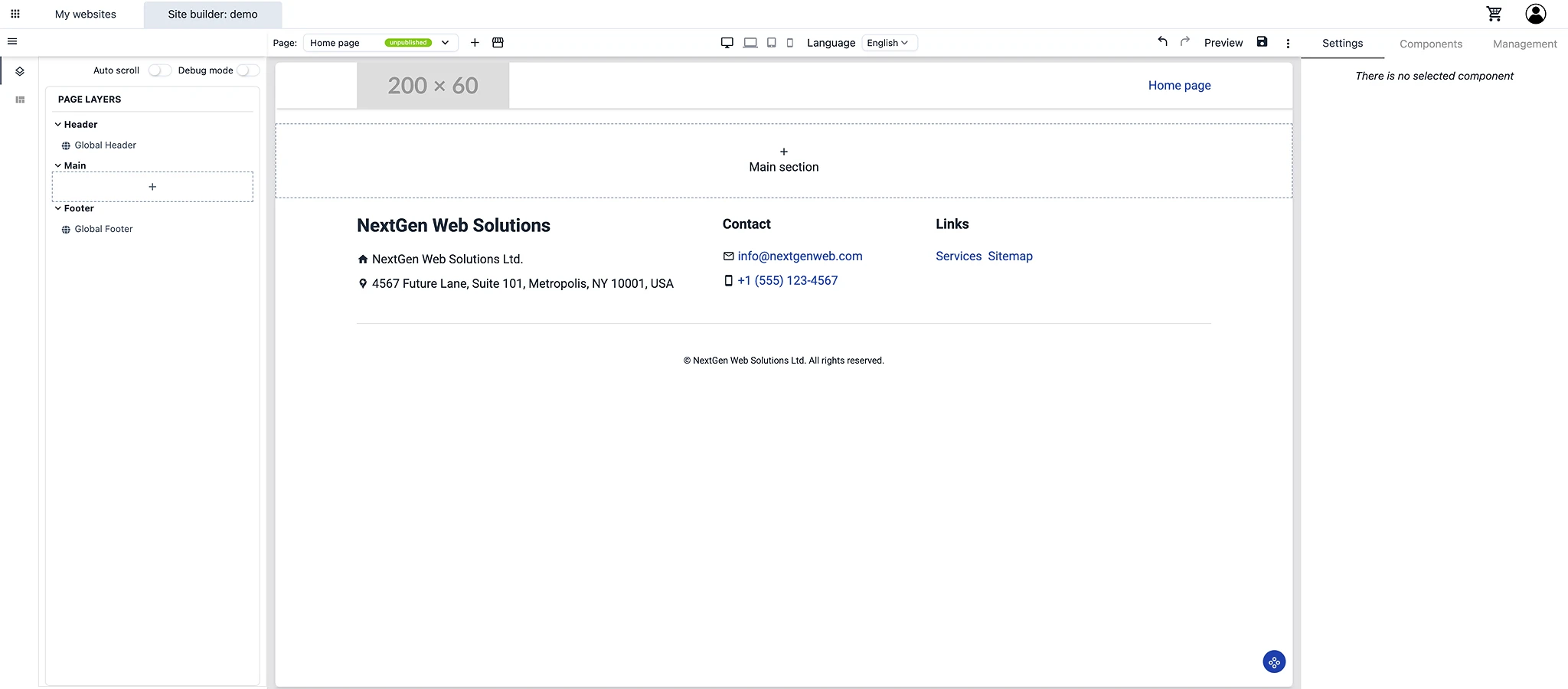
The builder is divided into 4 main areas:
Builder Workspace
├── Top Bar (Global controls)
├── Left Panel (Structure & navigation)
├── Canvas (Visual editing area)
└── Right Panel (Settings & components)
🧭 2. Top Bar – Global Controls
The Top Bar controls your page and system-level actions.

📄 Page Management
Select current page (e.g. Home page)
Create new page
Page status (Published / Unpublished)
🌐 Language
Switch between languages
Edit content per language
📱 Responsive View
Desktop / Tablet / Mobile preview
Adjust layout for each device
🔁 Actions
Undo / Redo
Preview page
Save changes
🌍 Website Actions
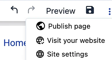
Publish page
Visit website
Open site settings
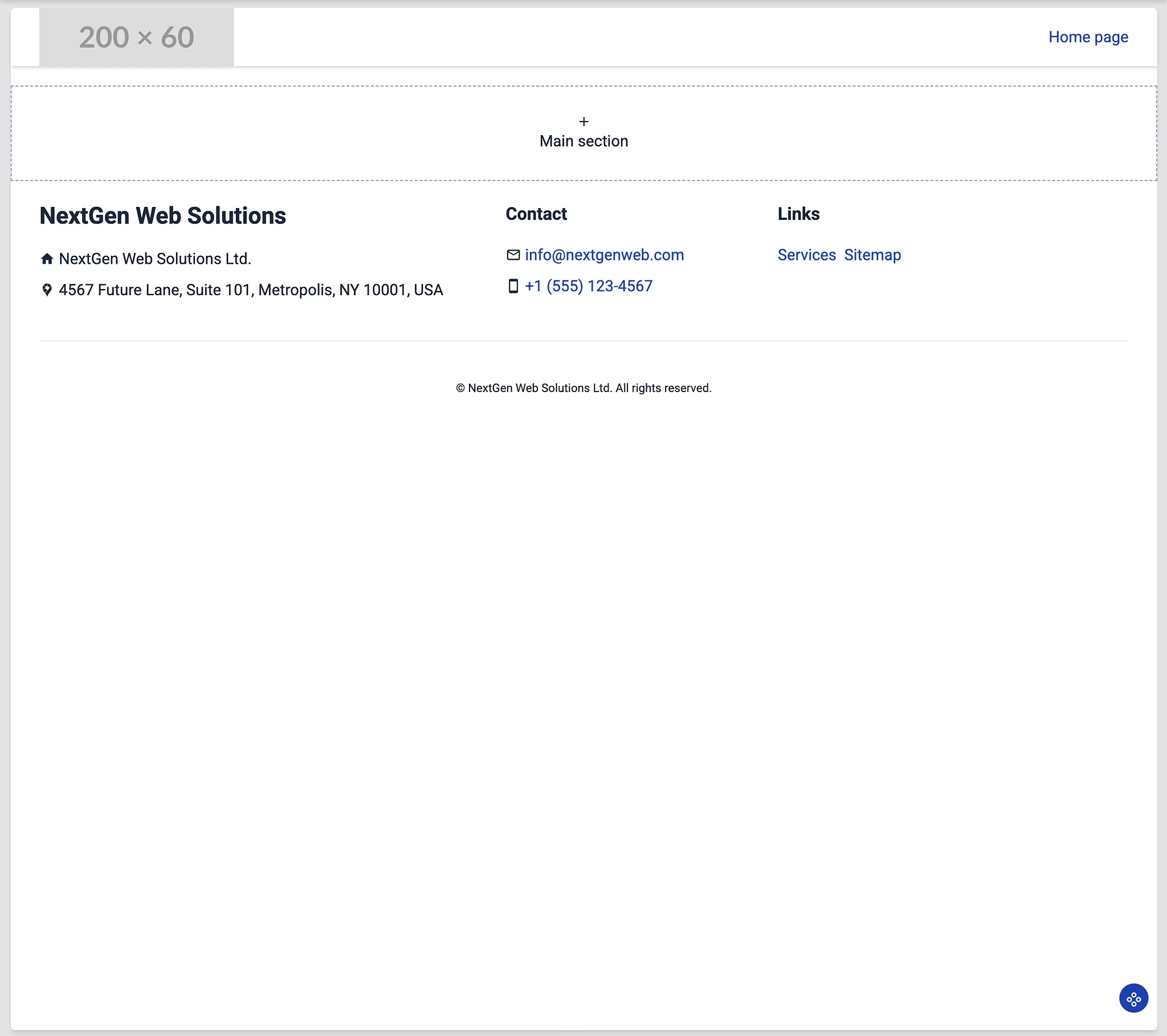
🧱 3. Left Panel – Page Structure
The Left Panel shows your website structure.
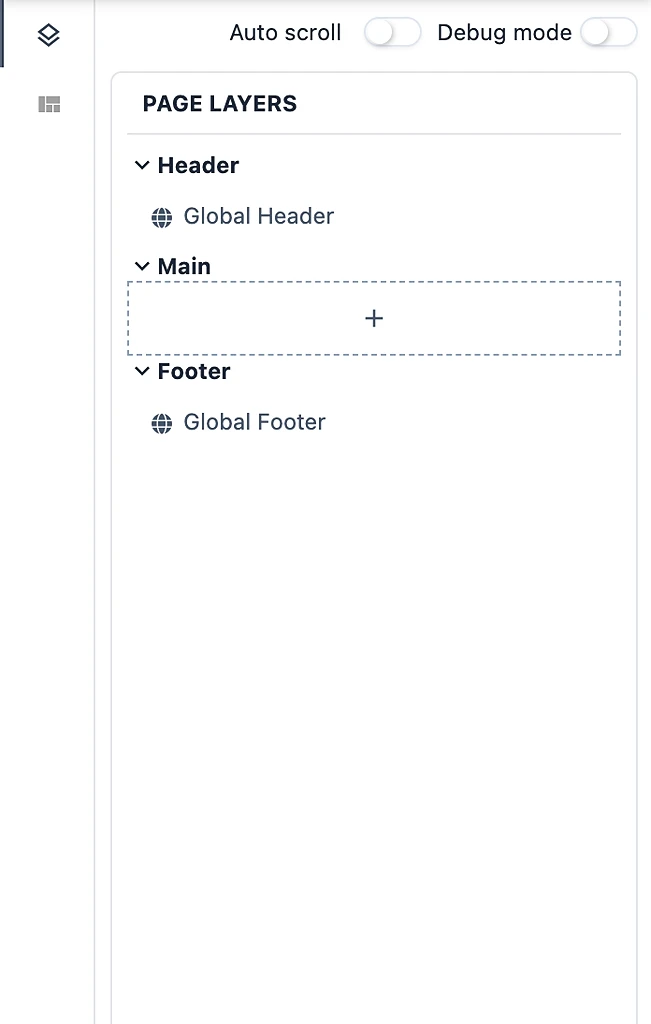
📌 Page Layers
Page Layers
├── Header (Global)
├── Main (Editable content)
└── Footer (Global)
🔹 Header / Footer
Shared across all pages
Update once → applied everywhere
🔹 Main Section
Main content area
Add sections/components here
🔹 Quick access component templates from app-store:
⚙️ Tools
Auto scroll → Follow selection automatically
Debug mode → Inspect structure
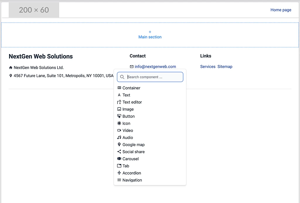
🎨 4. Canvas – Visual Editor
The Canvas is where you build your website visually.
✨ Key Capabilities
Click
+in Main sectionChoose from components/templates
🧲 Drag & Drop
Move components freely
Reorder sections visually
🎯 Select Component
Click any element to edit
Shows settings in right panel
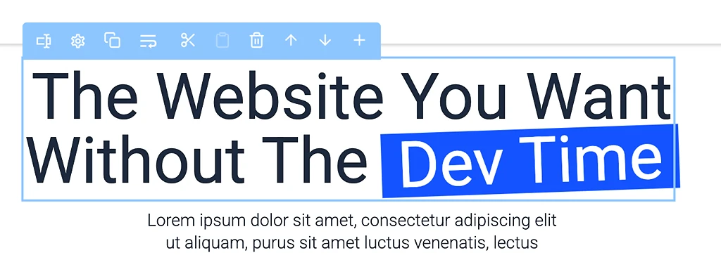
⚡ Quick Actions Toolbar
Move up / down
Duplicate
Delete
Add new component
🖱️ Right Click Menu (Component)
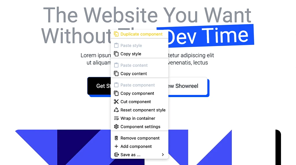
Duplicate component
Copy / paste style
Copy / paste content
Copy / paste component
Cut component
Remove component
Wrap in container
Save as template
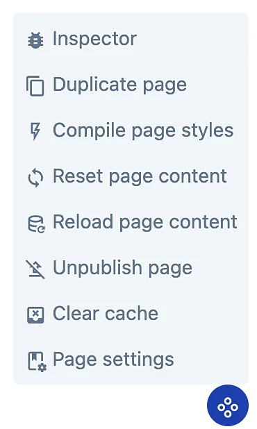
🖱️ Page actions control
⚙️ 5. Right Panel – Control Center
The Right Panel is the most important part of the builder.
It controls:
Content
Design
Advanced settings
Components
Modules (apps & data)
🧩 5.1 Component Settings
When selecting a component, you will see 3 tabs:
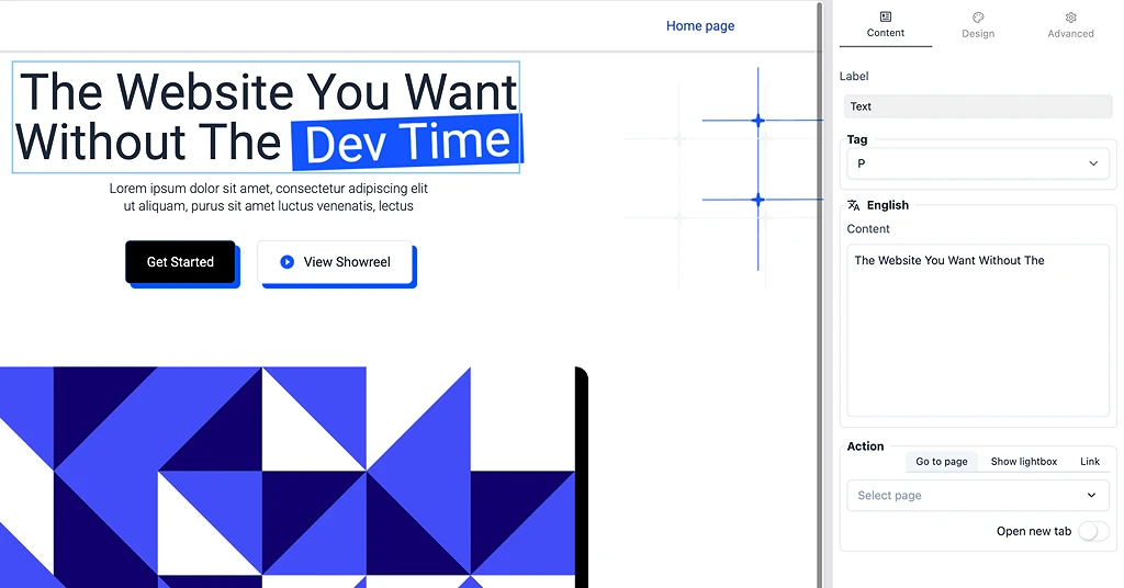
📝 Content Tab
Edit what users see.
Includes:
Text / headings
Images / media
Links & buttons
Multi-language content
Actions:
Go to page
Open link
Show lightbox
🎨 Design Tab
Control visual styling.
Layout
Display (block / inline)
Position (relative / absolute / fixed)
Flex settings
Alignment
Size & Spacing
Width / height
Min / max size
Margin / padding
Aspect ratio
Styling
Colors
Background
Borders
Shadows
Hover states
⚙️ Advanced Tab
Advanced control for developers or power users.
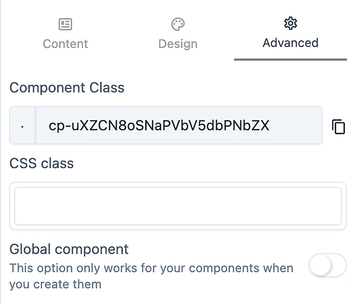
Options:
Component class (auto-generated)
Custom CSS class
Global component toggle
👉 Global component = reusable across pages
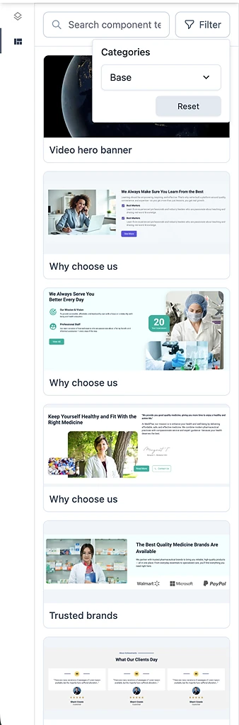
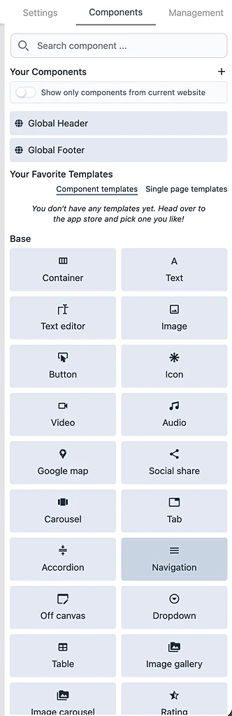
🧩 5.2 Components Panel
This tab is where you add and reuse components.
📦 Your Components
Components created in your website
Includes:
Global Header
Global Footer
⭐ Favorite Templates
Saved from App Store
Includes:
Component templates
Page templates
🧱 Base Components
Core building blocks:
Container
Text
Text editor
Image
Button
Icon
Video / Audio
Google Map
Carousel
Tabs / Accordion
Navigation / Dropdown
Table
Gallery
Rating
...
👉 These are the foundation for everything you build
🧩 5.3 Favorite Component Templates (From App Store)
Pre-designed sections you can reuse.
Examples:
Hero sections
Features
Testimonials
Pricing
CTA blocks
How to use:
Add to favorites
Drag into page
Customize
🧩 5.4 Favorite Page Templates (From App Store)
Pre-built full pages.
Examples:
Landing page
About page
Contact page
👉 A page template = combination of multiple components
🔄 Transform to Website
You can:
Start from page template
Add more pages
Build full website
🧩 5.5 Website Templates
Complete ready-to-use websites.
Includes:
Full structure
Pages
Components
Design system
🚀 How to use:
Apply template
Install required modules
Replace content
Publish
⚙️ 5.6 Management Tab (Modules & Data)
This tab connects your website to apps (modules).
⚠️ No Module Installed
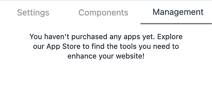
If empty:
“You haven't purchased any apps yet. Explore App Store…”
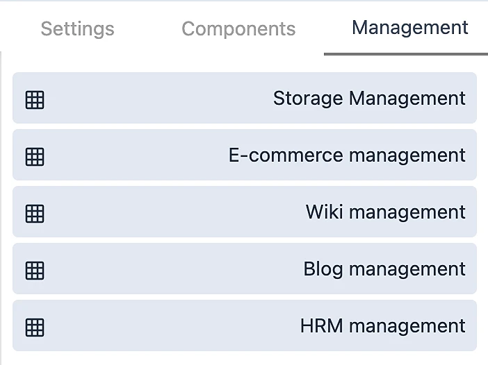
🧠 What Modules Do
Modules provide functionality:
Blog → content management
E-commerce → products & checkout
CRM → customers
HRM → employees
🔌 Install Module to Website
Flow:
App Store → Purchase → Available in Account → Assign to Website📊 Data Management
Once installed, you can manage:
Blog posts
Products
Categories
Users
👉 This is where data meets UI
🏗️ 6. Building Workflow
Step 1 – Create Website
Go to My Websites
Click Add new website
Enter:
Name
Language
Step 2 – Open Builder
Click Edit website
Step 3 – Choose Starting Point
You can start with:
Blank page
Component templates
Page templates
Website templates
Step 4 – Build UI
Add sections
Customize design
Adjust responsive
Step 5 – Install Modules (Optional)
Example:
Install Blog → add posts
Install E-commerce → add products
Step 6 – Connect Data
Bind UI with module data
Step 7 – Publish
Click Publish page
Website goes live
💡 Key Concepts
🧠 Component-Based System
Everything is a component:
Text
Section
Layout
🧩 Template System
Component → Page → WebsiteComponent = block
Page = combination
Website = system
🔌 Module System
UI + Module = Functional Website🌐 Multi-Website Architecture
One account → multiple websites
Modules shared across websites
Assign modules per website
🚀 Final Summary
Tumpixel Builder is not just a website editor.
It is:
A visual development platform
A modular business system
A scalable multi-site solution
🎯 What You Can Build
Landing pages
Business websites
Blogs
E-commerce stores
Internal tools